INDUSTRY:
EDITORIAL DESIGN, ILLUSTRATION, MIXED MEDIA, PUBLICATION DESIGN
CLIENT:
UCA: Final project
YEAR:
2025
SOFTWARE/ EXPERIENCE:
ILLUSTRATOR, INDESIGN, LINO PRINTING, SCREEN PRINTING

India Through The Senses: A Tactile Travelogue
about.
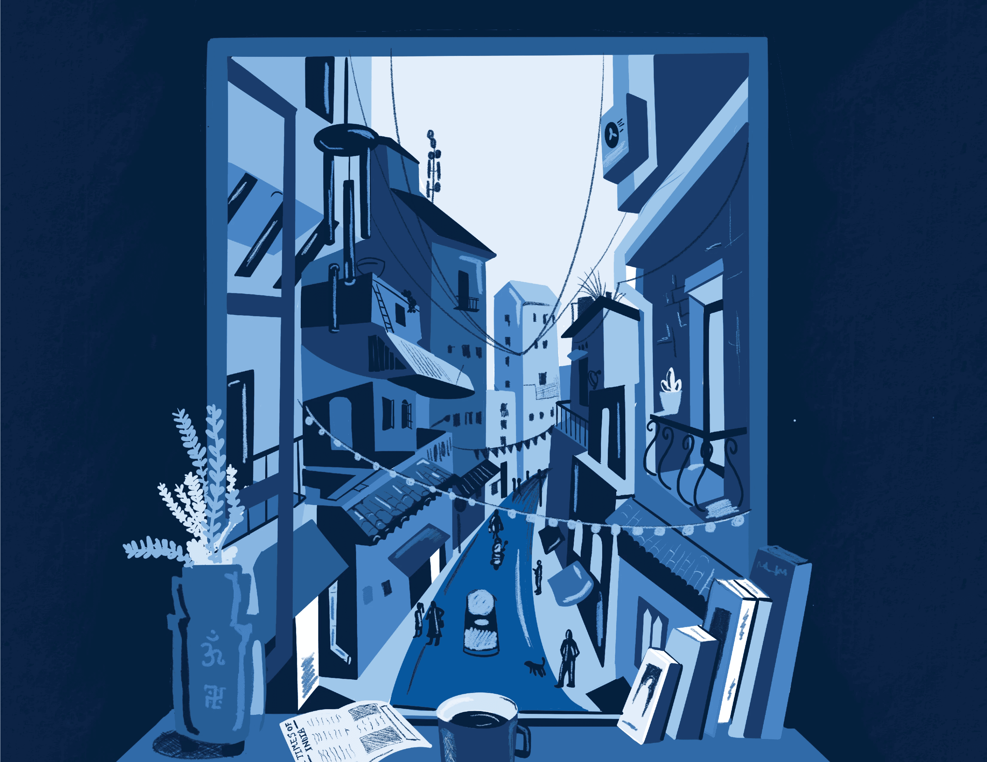
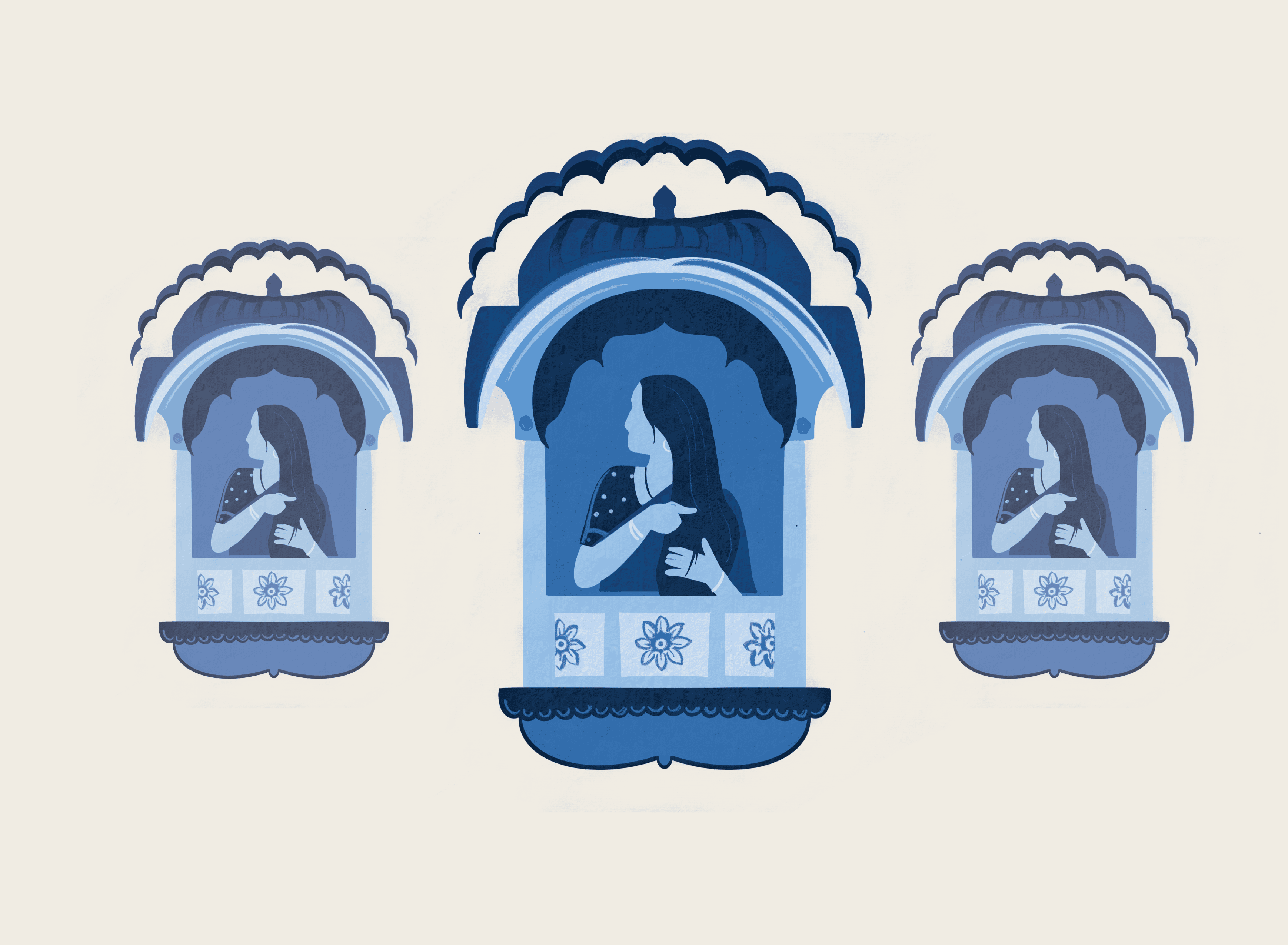
India Through the Senses is a self-authored experimental publication that explores Indian culture through nostalgia, memory, and sensory storytelling. The project originated during a return trip to India after a year away, where everyday experiences—temple visits, street markets, cooking with family, fabrics, rituals, and soundscapes—highlighted how deeply sensory Indian culture is. Rather than documenting India visually, the project focuses on how culture is felt through texture, scent, sound, and emotional association. Influenced by practitioners such as Gita Wolf and Tara Books, alongside Indian comics, street graphics, folk art, and contemporary illustration, the book reimagines publishing as an emotional and experiential medium. The project positions nostalgia as a design tool, using personal memory to create a culturally authentic narrative. Instead of functioning as a traditional travel or information-led book, the publication takes the form of a visual memoir, inviting readers to connect with India through lived moments and sensory cues. The work explores how illustration, layout, and material references can evoke memory and cultural identity, questioning how books can move beyond passive reading to create deeper emotional engagement.


challenge.
The project was developed through a research-led and hands-on process that combined personal experience, material experimentation, and audience insight. Primary research included travel across India, supported by photography, sketching, and journaling to document sensory experiences tied to food, architecture, textiles, rituals, and everyday life. Secondary research explored Indian art, street graphics, illustration, experimental book design, and tactile publishing practices. Early development focused on creating a fully multi-sensory book, leading to experimentation with lino printing, tetrapack printing, screen printing, handmade papers, fabric swatches, and research into scent-infused printing. Audience surveys revealed strong emotional connections to food, festivals, and nostalgia, helping refine the project’s focus. Midway through development, feedback and reflection prompted a shift from heavy physical interactivity toward illustration-led storytelling. This allowed sensory experiences to be communicated visually through composition, texture, colour, and symbolism, while retaining references to materiality. Workshops in printmaking, poster design, and layout further informed the visual language and structure of the final publication.


result.
The final outcome is an experimental illustrated publication that functions as a sensory-driven visual memoir of India. Organised around emotional and sensory themes rather than geography, the book captures moments of everyday life—rituals, textures, food, patterns, and environments—using narrative illustration and expressive layout. Visual influences from Indian comics, street signage, folk art, and contemporary illustration shape a nostalgic yet contemporary aesthetic. While tactile and scent-based elements were explored during development, the final publication prioritises illustration as a tool to suggest touch, smell, and atmosphere, allowing the reader to emotionally engage with the content. Material references, print textures, and handcrafted aesthetics remain embedded within the visual language, maintaining a tactile sensibility. The project challenges conventional publishing formats by presenting the book as an emotional object rather than an informational one, offering an intimate and personal approach to cultural storytelling. India Through the Senses demonstrates how design, memory, and narrative can work together to communicate cultural identity in a meaningful and immersive way.


Amrutha’s project is a rich, sensory experience that beautifully blends emotional storytelling with really thoughtful design. The book’s tactile and immersive qualities show a strong awareness of user experience and a lovely sense of place. I was especially drawn to how the layout beautifully balances text, clean space and intricate illustration. The blue colour palette ties everything together, and there’s a great rhythm across the pages. It feels deeply personal but also really refined. A lovely piece of work.

Caitlin Smith
Senior Creative- Mooncup Ltd

