INDUSTRY:
UI/UX DESIGN
CLIENT:
YEAR 2
YEAR:
2024
SOFTWARE:
FIGMA, ILLUSTRATOR

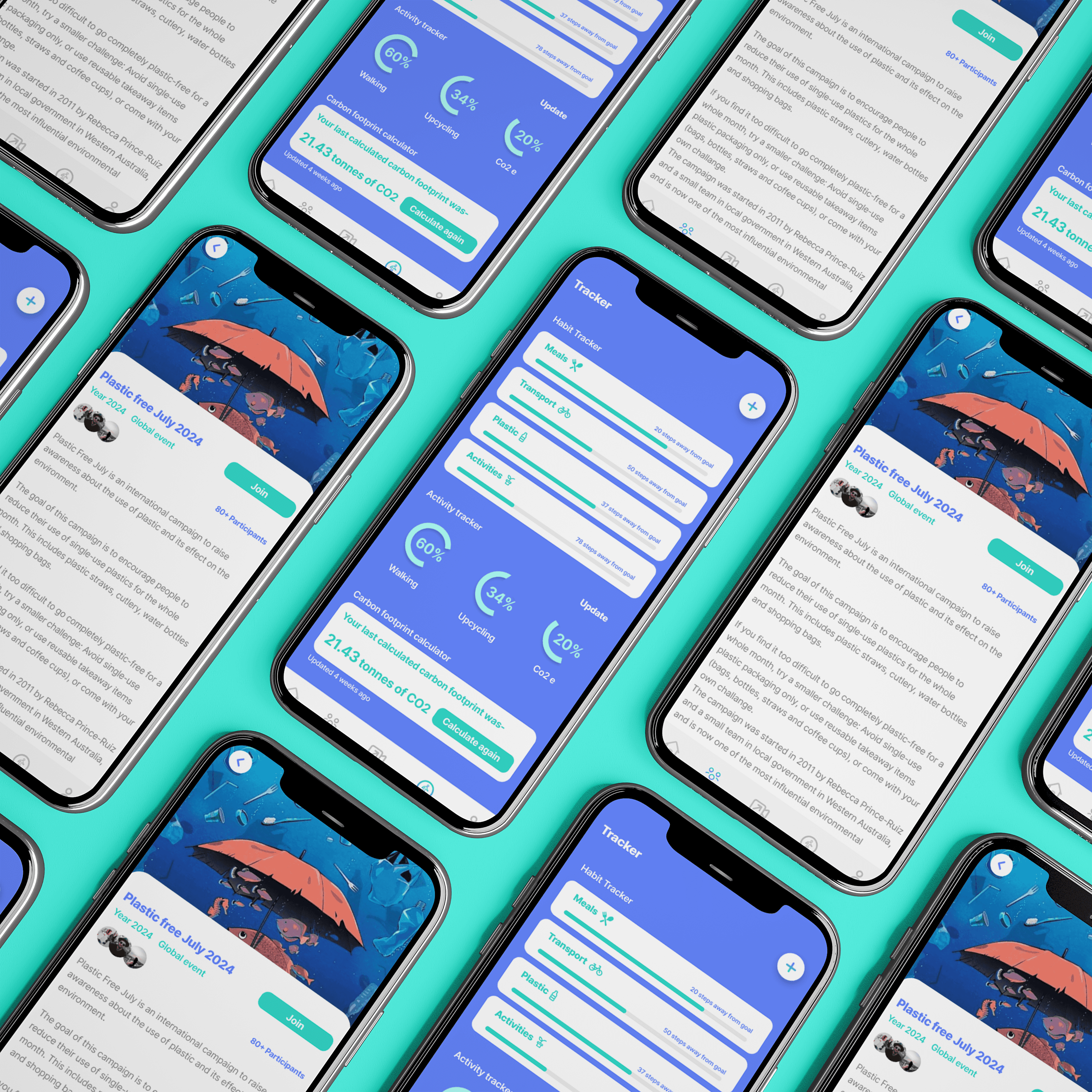
Vaayu: A weather App
about.
Vaayu is a climate-focused mobile application designed to empower individuals to take meaningful action against climate change through everyday choices. Rooted in the Sanskrit word “Vaayu,” meaning air or life force, the app draws inspiration from nature, cultural heritage, and collective responsibility. Vaayu aims to shift the mindset that individual actions are insignificant by transforming sustainability into an engaging, community-driven experience. Through features such as carbon footprint tracking, habit monitoring, challenges, educational content, and social sharing, the app encourages users to adopt greener lifestyles while visualising the impact of their efforts. This project explores the intersection of UX/UI design, behavioural psychology, and environmental awareness to create an accessible, action-oriented platform that makes sustainability feel achievable, rewarding, and impactful.


challenge.
The development of Vaayu involved navigating both conceptual and design-led challenges, particularly in encouraging user engagement with a topic that can often feel overwhelming or abstract. A key challenge was shifting the perception that individual actions have little impact on climate change, which informed a process grounded in user research, behavioural psychology, and iterative testing. Through surveys, personas, competitor analysis, and multiple rounds of wireframing and user testing, the design evolved to prioritise simplicity, motivation, and clarity. The process was highly iterative, with continuous refinement of features, navigation, and visual identity to ensure the app remained accessible, engaging, and action-driven while staying true to its environmental mission.

result.
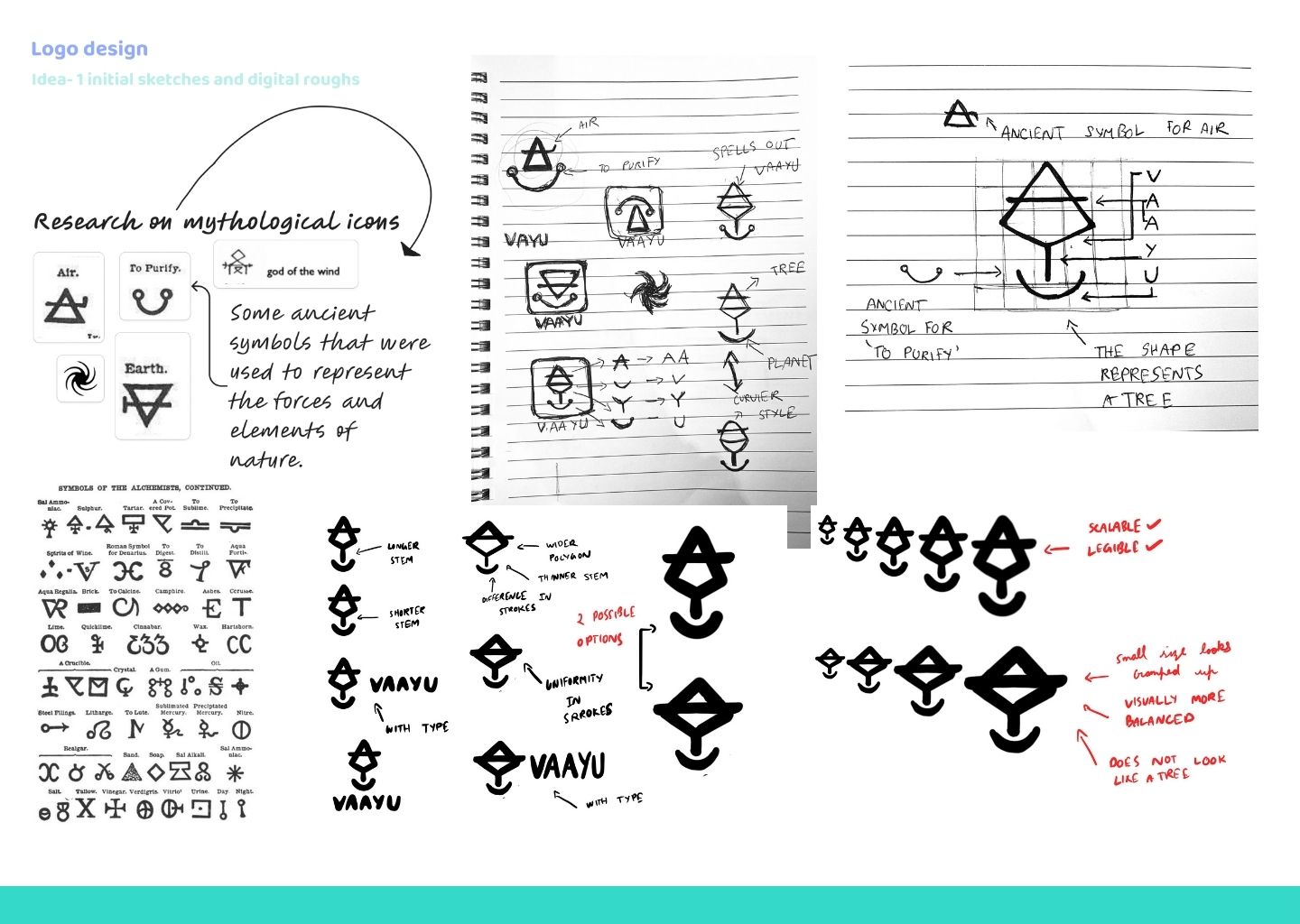
The Vaayu logo was designed to reflect both the app’s environmental purpose and its cultural origins. Derived from the Sanskrit word “Vaayu,” meaning air or life force, the logo draws inspiration from ancient symbols representing air, earth, and purification. Its form is constructed using the golden ratio, referencing patterns found in nature, while the negative space subtly spells out the word VAAYU and can also be perceived as a tree—symbolising growth, balance, and renewal. The colour palette centres around teal blue, indigo, and white, chosen for their strong associations with nature, air, purity, trust, and calm, while also conveying a sense of action and change. Through this project, I learned the importance of research-led design, cultural sensitivity, and iterative experimentation, as well as how thoughtful visual and UX decisions can strengthen storytelling, usability, and emotional connection within a purposeful digital product.


